Don’t know where to start? You keep loving all those pinterest photos but you just can’t get the whole idea of what you want? Here is a fabulous tool that can help you untangle that creativity.
A Moodboard is the Look and Feel of your future favourite place. It is basically an organized collage that has all the ideas, textures, colors and images that have been related with your design. The moodboard will help you to define a style or theme, a color palette, and sometimes the kind of furniture you want. So it’s kind of a big deal.
So let’s see what it takes to create one!
You can do this in any software you want: Photoshop, illustrator, powerpoint, or maybe Paint! Some people even prefer to put it on paper, old school and classic.
It must include:
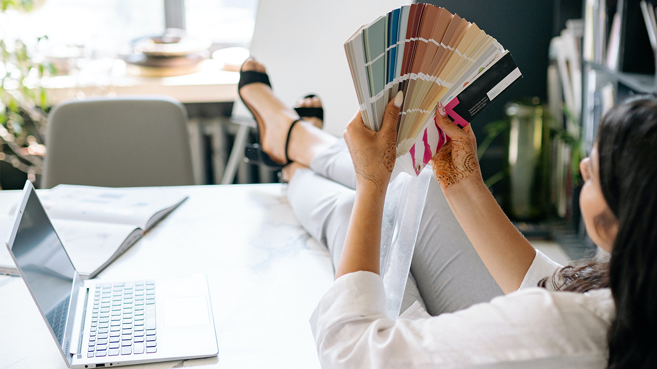
- Colors: Try picking up no more than 3 different ones. This will give you a general idea if the colors match together or if they make a great combination. You can even go to the hardware store and get some color samples if you’re undecided. Sometimes it helps a lot simply by changing one tone or selecting another tone to get to that point where you like all of them as a unity.
- Textures: It refers to everything that is not plain colors. For instance Wallpapers, fabric, carpet, wood, concrete, stone, etc. When choosing textures you must check the combination with each too. You don’t want a missed match either. I recommend picking one "star" texture and treating it as a focal point, and the rest of them more subtle as supporting textures; not too strong with light colors, just to not overshadow the main one.
- Referential images: pick images that include things you want to incorporate or resemble, or even things that represent your idea of the design. Preferably images that have the same color palette of your project.
- Referential furniture: include the furniture that you are sure you will put or similar. Sometimes it can help the overall project, if you have a mental picture of the furniture, this can be a specific sofa or hanging light you saw somewhere and you just love how it looks.
- Referential lighting: this is optional. Although a very important part of any design. It certainly starts when you want a certain kind of lamp or light fixture. Like I said, only if you visualize the exact item. This can help understanding the rest of tones and textures, like a bronzed color light or some very well spotted red in a big lamp, or even the tones of the metals.
Now, collect all that information and put it in one layout. Again, you can do this in any software that you prefer or even in a piece of paper. Organize the colors together and textures with the images. I prefer to organize all in groups; it is recommended to have everything in the same size for all the colors at one size of the layout to compare with everything you're using.
Start by arranging the colors all together in order of saturation, then the textures, the best 2 or 3 images as big thumbnails. You can try overlapping some furniture images, this way you can make both things compatible.
And last but not least, setting aside your favorite referencial lighting. If you have a specific theme, you can add it here even if you’re not going to use it, for example a picture of a rock star or some kids playing, a famous portrait like this pop-art, anything that helps you understand the kind of emotions and feelings you want to evoke.
At the end you will have something like this:
(photo) EDITING.
Now, you can make as many as you want but you'll need to choose one.
If you're designing for a client it is better to give him options. Perhaps 2 or 3 shall do it. This can be helpful when you or your client aren't sure which way to go.
If it is your own space and you already know a type of style or theme, maybe one will be enough. Remember, this is a tool to help you say what your words can't.
This step is not necessarily mandatory but it is a great GREAT recommendation if you’re stuck or don’t know where to start…
Have any comments?
Send us your feedback!